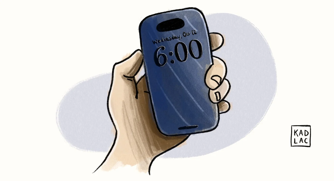
It’s six am and my muffled iPhone alarm wrestles its way up through the valley of sheets. It’s calling for rescue, a political phone prisoner after having its snooze button punched more than a couple of times.
It shares its ruthless truth with me from arm’s length: It’s time to wake up.
Stretched out on the bed, I peer at my phone with one open eye. The number “6:00” stares back in a heavyweight serif font.
The clock numeral is the first font of the day I notice. I don’t know which typeface family it comes from, because Apple decided to simplify by using tiny little thumbnails instead of the typeface’s name. “Maybe I’ll Google this later,” I think to myself.
I chose this font because I love the artistic elegance of serifs, and this exudes personality. Sans-serifs have always felt a bit more lifeless to me.
Typography is delicious because it can manipulate, encourage, inspire, scream, or whisper. It can be used for art or design. Use it once to create a beautiful piece of artwork, or use it again and again to create a relationship with what you’re selling.
Or, use typography to put a designer in a slightly better mood even after double-checking the time, hoping it says five am instead of six. The truth stings a little more now. I’m in a hurry, but it’s difficult not to notice the subtle design nods in the nooks of my routine, even if life looks like a bad layer blur effect through my tired eyes.
•••
I shuffle towards the kitchen with my empty water bottle, where I find myself in front of a giant water tower. It’s a stainless steel water filter made by Berkey. Even at six am, I’m impressed by how good a shiny tank of water can look sitting exposed on a countertop.
While filling my water bottle, I’m face to face with the Berkey embossed logo, designed in a heavy serif font like my iPhone clock display. The bubbly serifs of the letters are soft, like the proud and bubbly 70’s typeface Cooper. This typeface is seen everywhere, especially when someone is trying to imply, “this thing is retro!”
With my water bottle topped off, the silver logo bottom-aligned to the base catches my eye. The designers opted for discrete branding. The name, “Purist” is set in a slightly modified sans-serif font with enough cushion between the letters to indicate it’s the future of drinking. If Tesla included a water bottle with a car purchase, this is what they would give you.
I take a quick swig of water while simultaneously punching the single coffee button. I select 5-9 cups, one of two options that require my immediate attention. The timer of this OXO-designed coffee maker is set in a traditional monospaced typeface, which you see across digital clocks everywhere. It’s nothing special at first glance, but there’s a beautiful harmony given the forced equal spacing between the letters. Monospaced fonts have this beautiful built-in nostalgia, reminding us of the simplicity of artisan letters forged from the metal hands of a typewriter.
Looking up at the clear water basin, the numbers of cups are stacked vertically against, printed in white ink. The numbers are slightly faded, worn off by the constant refiling of my caffeine addiction. Each number is designed by a simple sans-serif font that’s not large enough to distinguish this early in the morning.
•••
With my coffee and water in hand, I think about whether I should sit down and write or attempt a half-assed stretch routine on the chunky wool kitchen runner that doubles as a cushy yoga mat. I’m always drawn to this rug, because of how the wool feels beneath the arches of my feet.
The rug is designed by a company named Floyd, but you would never know because the high stark red logo tag folds discreetly underneath the rug. Floyd’s logo is confidently set in a custom typeface sans-serif called Floyd Gothic. It’s based on the signage of an old factory, with its uniqueness coming from the large ink traps in the letters that look like tiny ant farm trails being dug between the crevices of the letters.
As I’m mulling this decision to stretch or to write, I glance across the kitchen where logos and typefaces are splashed across fruit labels, tea bags, Yeti mugs, spice containers, and coffee bags filled with beans from Costco. Even if the sun hasn’t risen yet, I can’t avoid appreciating how much work goes into designing the placement of every individual letter.
The way a designer stretches, scales, or sizes a letter can ooze an emotion. The rustic type of the olive oil container sitting in the dark takes me to a different part of the world. The empty box of Banza noodles sitting on the counter has a logo set in a playful and chunky sans-serif font to confidently state, “Hey, we’re chickpeas but we’re no different than macaroni!”
But in a split second, a font can either bring me joy, or punish my eyes repeatedly.
I decide to skip the stretching routine on my favorite yoga mat of a rug, and sit down on my tufted faux leather Ikea sofa with walnut legs purchased from Etsy. I push open the beautifully designed fruit lid of my laptop, and open a new browser tab and to load Google Docs.
Like the morning ritual of taking the first sip of coffee, there’s one thing I need to do before typing my first word. I float my cursor up to the font dropdown and immediately change the default font from Arial to Helvetica. Because Arial is a Microsoft ripoff of Helvetica, and I’ll never switch to the dark side.
What’s my favorite font? It’s not Arial.