I’ll let you in on a secret that you may not have been told:
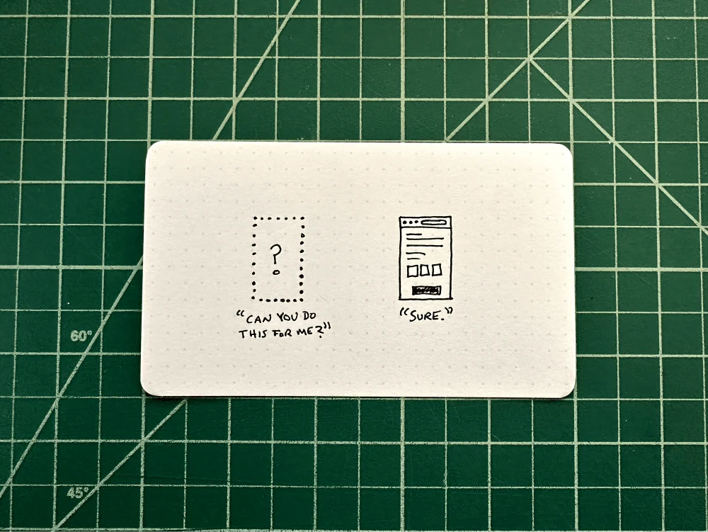
You, my friend, know what good design is.
The objects scattered about in your room are designed by people who obsess, experiment, and endlessly iterate on.
You know design because you interact with these objects every minute of every day. You made conscious choices about which designed objects to include in your life. These objects reflect your design sense.
Even the text that you’re reading right now was designed specifically for the web, to be viewed on a screen like yours.
What if I turned the question around and asked you to choose a useful typeface for your next presentation or website?
You might not know where to begin.
Type is eating the world
Type is all around us. Online, it’s 95% of what we consume. It’s in the news, our emails, and even in this annoying app notification I just got.
Offline, it’s in the signage that guides us down our streets, the books we read, the packaging of our food, and the old city map of San Francisco hanging above my desk.
These snippets of text were meticulously designed and chosen for their context. For that billboard to capture your attention for half a second, its size had to be large enough, and the typeface not too delicate to stand out from the landscape.
The small text notifications you receive on your phone use a typeface designed for the screen to be readable at arm’s length. And I have long arms!
The texture of type
The spacing between the letters, words, and lines is a type’s texture. It’s a fancy way of describing the harmony and rhythm our brains crave when we read. If the text is gasping for air between the lines, we’ll feel fatigued or lose your attention to something else.
Try squinting your eyes at an article online, letting the type blur out of focus, and note how the texture makes you feel. Does it make you feel anxious? If so, and you had to adjust the text, you might want to increase the leading, the vertical spacing between the lines.
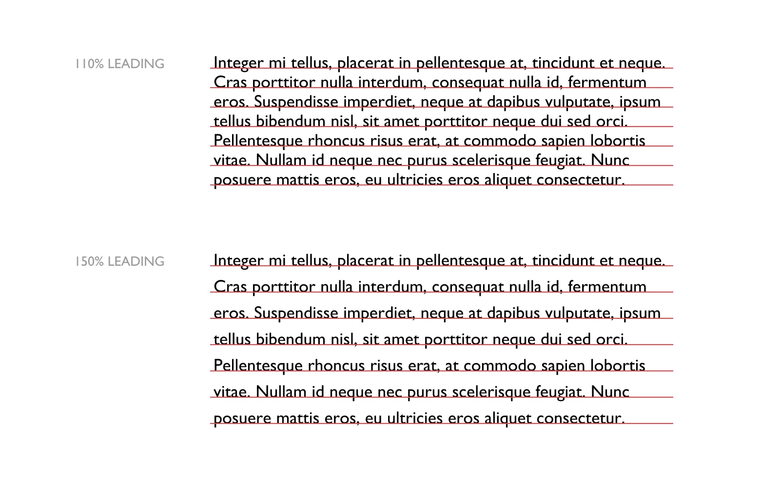
Yes, printers back in the day used thin strips of lead to increase the spacing between lines of text. Now we can swiftly adjust that ourselves.
As a general rule, use 130% of the size of the font. For example, a 16pt font would use 36pt of leading or line-height.
Where to even begin?
Poor type choices can affect the readability of an article in the same way that poor audio can affect a listener’s attention of a podcast.
Unfortunately, there aren’t any rules in typography. Like cooking, there are principles and best practices, but nothing to prevent you from scorching your eggs, even if they are still edible.
That billboard from earlier? It’s using a display font designed for large pieces, and it wouldn’t work well for those minuscule in-app notifications that you should abruptly turn off. Could you still use it for notifications? Of course! But you know better because you know good design.
Part of making a smart typeface decision is to understand how you want to use it. We usually look to choose a typeface based on how it will be used. If you spend just 30 seconds looking up the font’s page, you’ll see what the designer’s intent was.
For starters, display fonts are used for headers—or billboards—and they are designed differently than body text. Body text is just that, it’s designed for It’s subtle, of course, but stick with me.
The size of the type should be large enough that one line of text should not exceed 45-75 characters. Our brains have a hard time consuming more than that without losing our visual context.
Find your favorite typeface
“As with philosophy, music, and food, it’s better to have a little of the best.” — Robert Bringhurst
Open up your type panel, and you’ll have access to hundreds of choices, even gimmicky faces like Comic Sans or Papyrus pleading with you to be used. Ignore them! Leave these for the people who choose not to wear pants at 3 pm. Yes, it takes a bit of effort to put them on, but you do because you know good design.
Remember, what you’re looking for are trusted typefaces built for the purposed that it’s intended. It’s hard to do this, looking at a list of pre-installed fonts.
You’re in luck, though. Hidden in this list are already some time-tested favorites. Georgia, Verdana, Helvetica Neue, Caslon, Avenir, and Proxima Nova. Even Baskerville—created by John Baskerville in the 1750s—was a favorite of Benjamin Franklin.
Serif or sans-serif
There are many different classifications of fonts, but unless you’re looking for a script, you can boil your choices down to a serif or sans-serif typeface.
Serifs are generally easier to read, and here’s why:
The serifs give us a bit more information to distinguish between the characters, and so as we absorb the words on a page at a glance, it’s easier for our brains to immediately decipher what we’re reading.
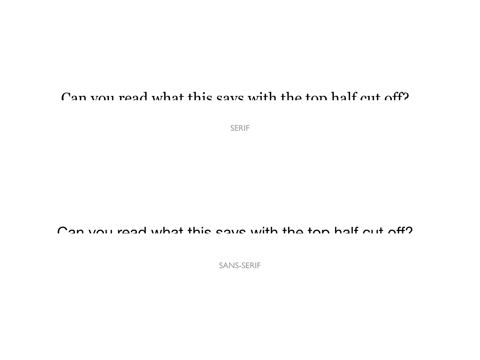
Don’t let this hold you back, though. Find a proven font that evokes the feeling you want your reader to have.
Select a flexible type family
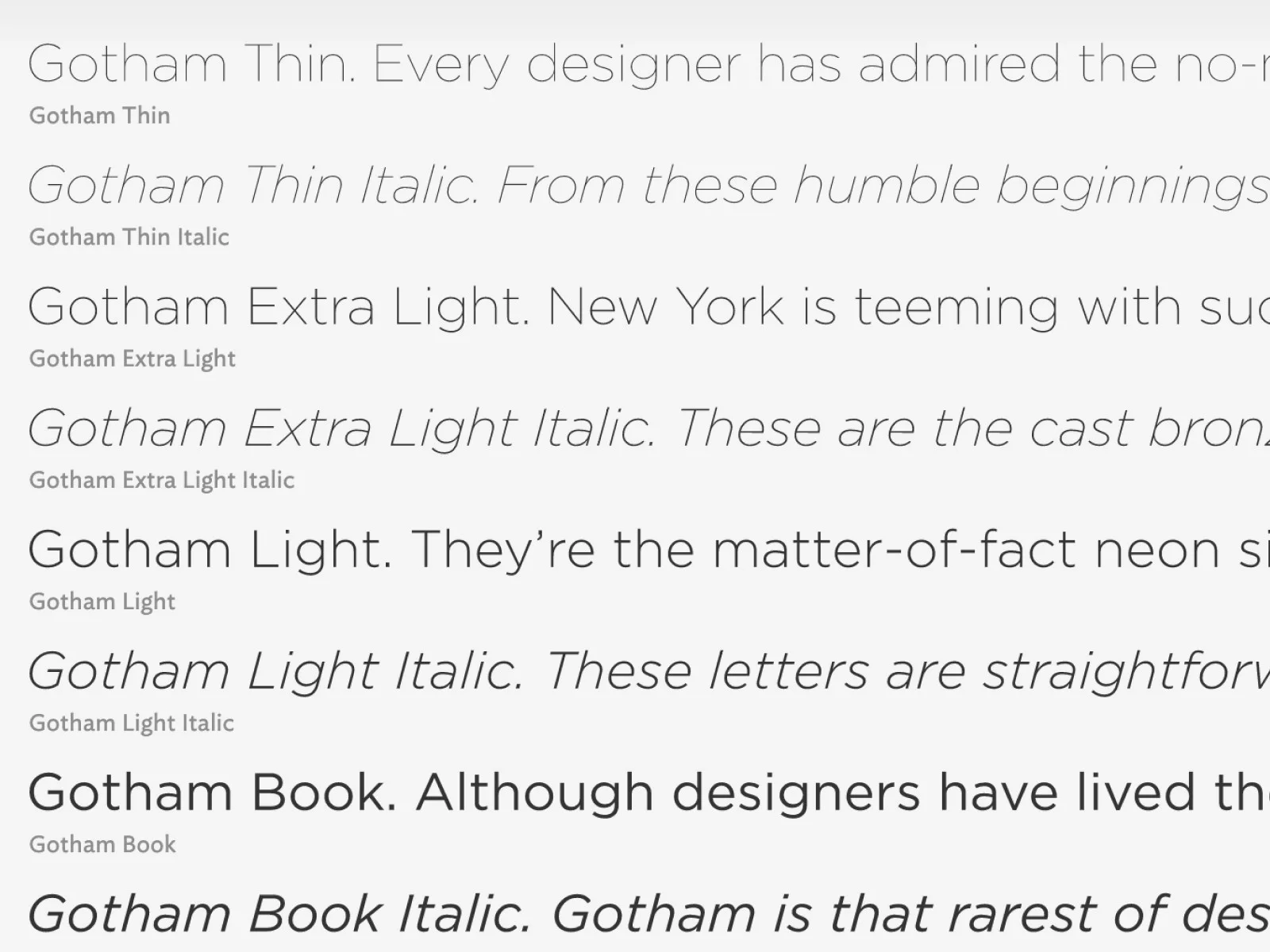
Now, if you want to make it easy on yourself, you’ll look for a typeface with a built-in variety of styles and weights. It’s like buying a DSLR camera versus using a small point-and-shoot. Because you know good design, having a typeface ready to work gives you peace of mind.
Gotham, shown here, has 16 styles! While you might not need more than a few, you’ll have the flexibility to choose one typeface and use it for both display and body text. You could stop here and have confidence that they all work together in a variety of ways.
Create an emotional response
Good design is a magic act. It’s performance initially draws you in, but then quickly disappears into the background.
In “The Elements of Typographic Style,” Robert states that “Type must draw attention to itself before it is read, but in order to be read, it must relinquish its attention that is drawn.”
This is where things can go downhill quickly. If you choose a typeface based solely on its cute, whimsical features, they will draw the reader in, but leave them for waste on the side of the road. Tired, angry, and annoyed that it was too hard to read or that it distracted from the story.
As someone who relishes excellent design, you’ll instead use your flexible type family to affect size, contrast, and spacing to create harmony and rhythm.
Let’s say you want to design a site for classic Italian bikes. These bikes are workhorses, fast, elegant, and downright sexy. These are the same characteristics you’ll look for in a typeface. So, we’ll start with a serif font.
You might want a separate display typeface for the headers and one for the body text. This lets you use something more interesting at large sizes, but at smaller sizes, you’ll depend on a legible face, so your readers don’t lose interest because they’re exhausted. I said you know good design, but I can’t vouch for your writing.
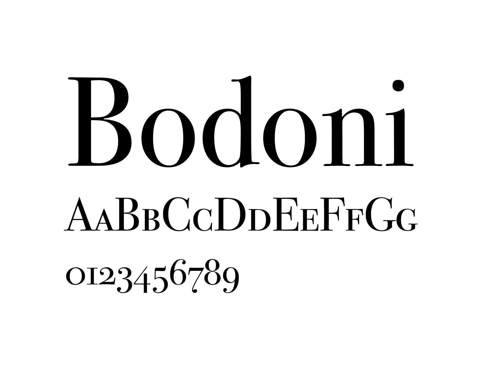
In this case, I might decide to use Bodoni for the display font, a gorgeous Italian typeface originally designed in 1790. It also includes nine styles. But, you probably knew that already.
For the body text, we’ll choose something familiar to contrast the intense beauty of Bodoni. Gill Sans, designed by a British designer, Eric Gill, in 1926.
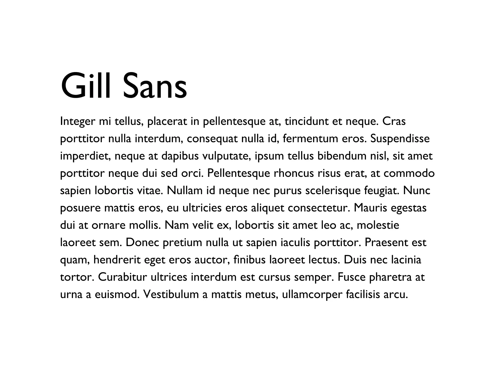
While two serif faces can work in tandem, sometimes using compositional contrast lets each shine more thoroughly.
The end cap
It’s just not necessary to know how to wield hundreds of typefaces. Some of the most well-known typographers during the Renaissance had only one roman font to use. A Blackletter and a Greek variant. Imagine that.
Typefaces are designed by people who know good design, just like you! No longer should you feel pressured to choose the first one peeking out from the endless list.
Tips on type:
Font vs. typeface: I know these words are thrown around a lot. Typefaces are how we talk about the design in full. Proxima Nova is a typeface. A font is a format or file. Proximanova.ttf is the font.
Examine any text on the web using Fontanello
Popular type foundries include Hoefler & Co., House Industries, and Monotype.
There are many ways to get web fonts. If you have an Adobe Cloud subscription, Adobe Fonts.
Books include The Elements of Typographic Style, and Typographie: A Manual of Design
Lastly, Typewolf has a great newsletter.
Typography is just one piece of the puzzle. For more practical guidance, check out my 20 unconventional design tips for non-designers.
