“What do you want to be when you grow up?”
I remember never having a simple answer for this basic question. It was as clunky as the ordinary, “what do you do?” question we get as adults now.
Back then I’d answer, “Professional sports card artist.”
“Huh?” was accompanied by the crooked head.
I was obsessed with drawing sports figures. I even had an unfinished, headless life-size portrait of Chris Webber on my bedroom wall before he was suddenly traded from the Golden State Warriors to the Washington Bullets. (It’s hard to imagine that as a team name now, isn’t it?)
In the ’90s, most sports card sets included a number of cards that were painted portraits of star players. They were worth almost zero cents as a collectible, but I couldn’t believe artists were paid to paint sports players. What a job!
I spent much of my childhood drawing and playing sports. Even as an artistic kid, I was always looking for shortcuts. I would record cartoons like Teenage Mutant Ninja Turtles, then pause the recording while we drew out the scene.
My dad even had a projector that would reflect a photograph upwards through a piece of glass, which would shine through a piece of paper if placed over it. It was easy to copy that way.
I learned an important lesson early on. Copying is a shortcut to increasing your drawing skills.
Here are the 10 steps I’ll cover to help you learn how to draw (without drawing paper).
Rethink everything you know
Learning to draw is like learning a language.
You don’’t need to be 100% fluent to get around, or have gone to art school. Knowing just enough to be conversational requires around 60-80% to get by.
How to learn to draw is something that’’s not easy to teach. But, to draw something unique, you don’’t need to have thousands of hours studying theory and practicing just to create something visually inspiring.
The truth is, I consider myself more of a remixer than an artist. I can’’t draw a perfect human figure from scratch. I roll my eyes at spending hours and hours behind a canvas. So, I prefer to pick reference materials first and use those as guideposts. And referencing photos shortcuts my process to creating custom illustrations. For those who prefer structured learning, there are many drawing tutorials available that can guide you through basic techniques to advanced applications.
So, here are 10 steps to creating visually dynamic digital illustrations for beginners.
The Setup: My toolset
I spend most of my time drawing for digital purposes. So I like to stay in the digital realm as much as possible. This makes the workflow frictionless, so I don’t need to draw on paper, but you’re more than welcome to do so.
Here are the tools I use:
I would urge you to experiment with a lot of pencils, ink pens, and brushes in Procreate to get a feel for how you enjoy using them. Additionally, experimenting with different brushes available in Procreate is crucial as each brush has unique abilities. Explore varying levels of pressure and stroke speed to understand the different effects produced by each brush.
Basic tools and features to get familiar with
Getting started with Procreate means diving into its rich toolkit. The app’s toolbar is your command center, divided into several key sections: Brush, Color, and Gestures menus. The Brush menu is a treasure trove of options, offering everything from basic pencils to intricate textures. You can customize these brushes to suit your style, making it easy to achieve the exact look you want.
Next, the Color menu is where you can unleash your inner colorist. With a vast palette at your disposal, including the HSB color model, you can select and tweak colors to your heart’s content. The HSB model is particularly useful for adjusting hue, saturation, and brightness, giving you precise control over your artwork’s color scheme.
Finally, mastering Procreate’s gestures will make your workflow smoother. Simple gestures like pinching to zoom, rotating the canvas, and using two fingers to undo actions can significantly speed up your drawing process. These intuitive gestures make Procreate not just a tool, but an extension of your creative process.
Step 1: Use an existing piece of content
Visuals typically support another piece of content. If it’s an article, a video, or something else, you might have an idea of what you want to draw.
It’s helpful to have written the article, shot the video, or built the product so you have something to draw for. When I illustrate this newsletter, drawing is the last thing I do. That way, I already have some context for what I should be doing so I don’t waste time coming up with ideas.
I have a process of searching Google images, looking at my own library, or even taking my own pictures.
But if you’re just drawing for fun, you can skip this step.
Step 2: Brainstorm a collection of visual ideas
You probably don’t know what you’re going to draw yet, and that’s ok.
When I start out, I let my imagination run wild. For example, if I need a visual metaphor to describe the internet, I’ll do a quick Google search and start looking at images that might relate to this idea. Or if I’m writing an article based on the concept of selling onions online, I might look for clouds and onions.
I might save some pictures of clouds, technology-related objects, or other images that pique my interest. The idea is to grab a few images that act as a launching pad for your own, remixed idea.
What you’re looking for are interesting metaphors for ideas. Images that might work well together, like electronic cables weaving up into the clouds. But, it’s ok to just pick an image with a clear meaning like the one I did for last week’s article, Make it Yours. It was an article on personalizing a bike, and so I drew a bike. No harm, no foul.
If you’re struggling with finding images, get out your phone and take photos of things around the house. If you need a picture of your hands, take a picture of your own!
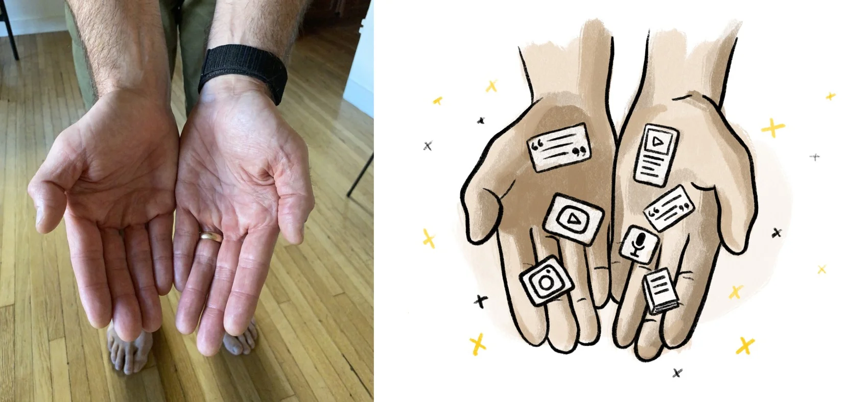
Collect around 3-5 images and start thinking about how to remix them in the next step. I usually add these to my photo library app on my iPad so it’s easy to access in Procreate.
Step 3: Remix your ideas
Now it might seem like the ideal time to open up Procreate and jump right in. But I recommend taking 10-15 minutes to take your collection of images and come up with a real concept.
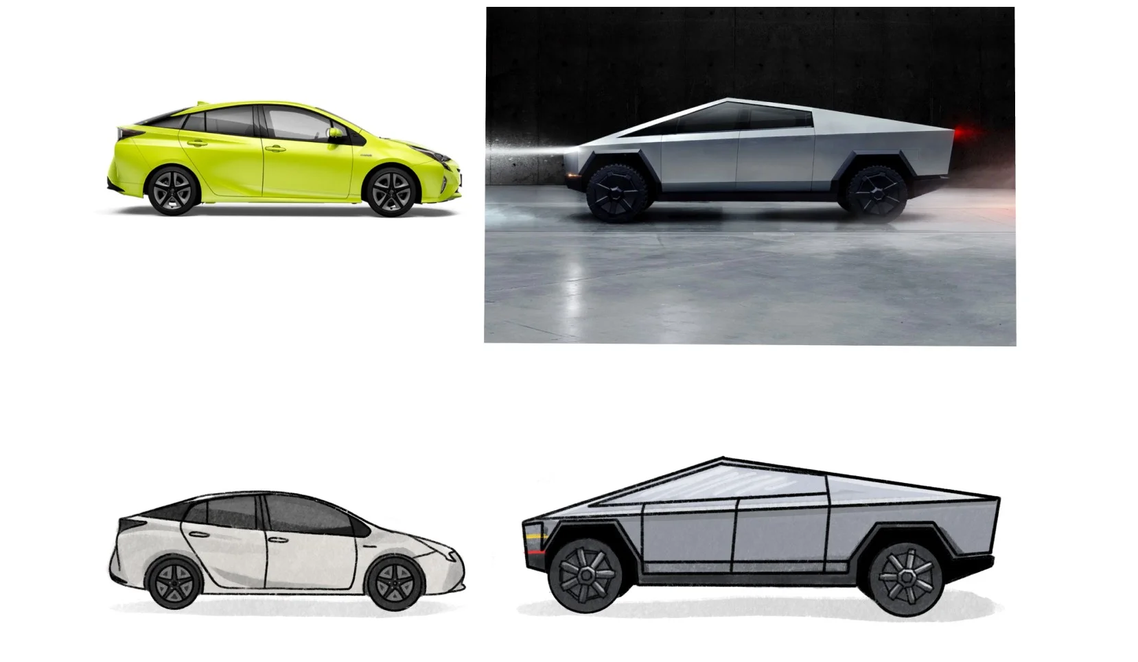
The reason is that you could easily just trace an image in your style and be done. But usually, the most iconic and memorable images come from creating a composition. A strong metaphor.
The way this happens is by creating something unique and visually grabbing.
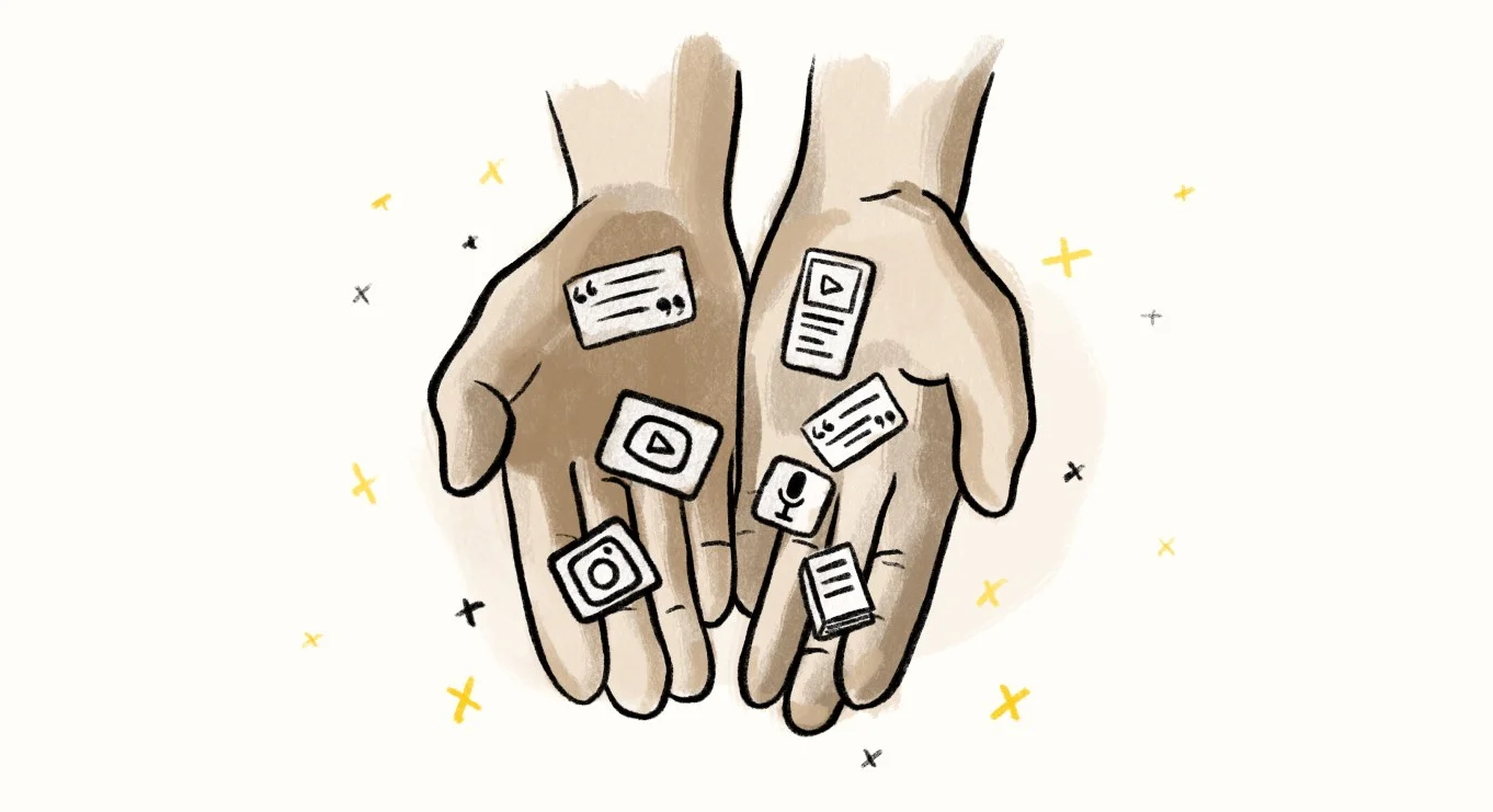
Some of my most popular illustrations came from combining and remixing photos together. One of my favorite examples of this is from my article, Konmari your creative life. I wanted to create a visual that felt calming and welcoming. This was also a play on Marie Kondo and her book, The Life-Changing Magic of Tidying Up. Instead of decluttering your home, I wanted to present control of your digital clutter.
For this piece, I thought a pair of hands opening up, with some small branded artifacts would catch people’s attention.
I shot a photo of my hands so I could trace them, then simply added branded artifacts on my hands as a way to show which assets I was organizing. Some of the sparkles and stars that were added to the piece came after I was finished drawing.
This image wouldn’t have been as strong if it were just the branded artifacts or the hands. Remixing these two ideas created a much more compelling visual.
Take 10 minutes and think about how to combine 2-3 images, and I’ll show you how to lay them out in the next step.
Step 4: Get your iPad and set up Procreate
Now that you have an idea of what to draw, we need to get into our drawing software and add our images. (Learn more about the Procreate interface here.)
Procreate is a powerful piece of drawing software that might feel intimidating, but we’’ll just use a few of the basic tools. Drawing guides are particularly useful for creating structured designs and enhancing symmetry in your artwork.
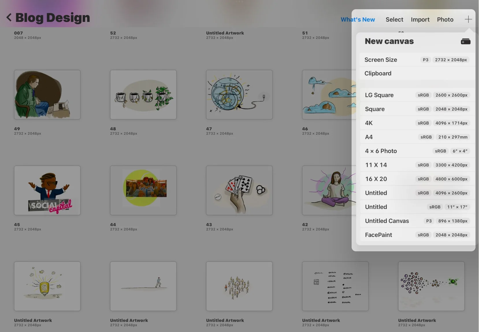
**Create a new document
**Start by creating a new document, using the default “Screen Size option.” You’ll be staring into a blank canvas, and you’ll next need to add your 3-5 images. Or the ones you decided to use.
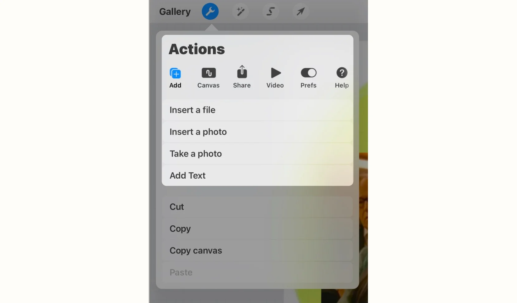
**Add your images
**Tapping the wrench tool in the top left opens a popover menu. Select “Add” from the first icon and insert the photos that you collected from your Google search.
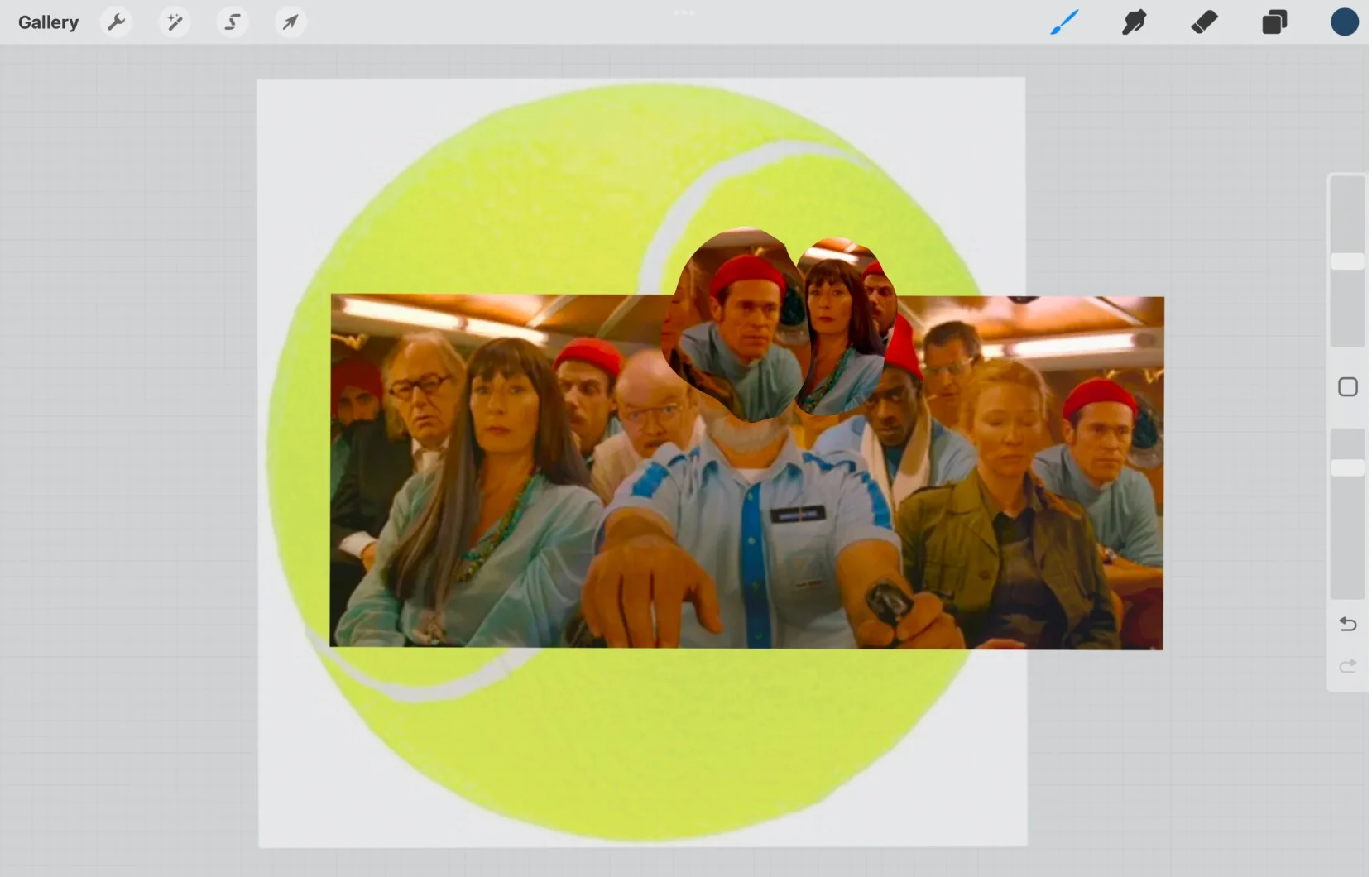
**Move and mix
**Before we start to draw, we want to create a rough composition by moving the images into place. We’re not trying to draw from scratch, but layer the photos to create an interesting composition that we can trace.
In this example, you can see how I layered the images into place to create something strange and unique.
**Reduce opacity and set up our drawing layer
**At this point, we want to prep our file by reducing the opacity of our composition so we can still use the images for reference.
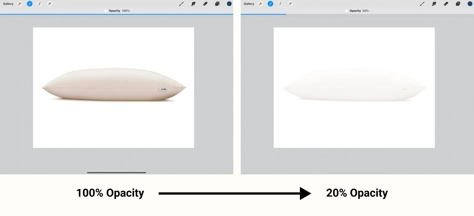
We’ll also create a new layer above the old one so we maintain control over our new illustration. We don’t want to draw on the same layer as the photos, because we’ll hide that completely once we’re done.
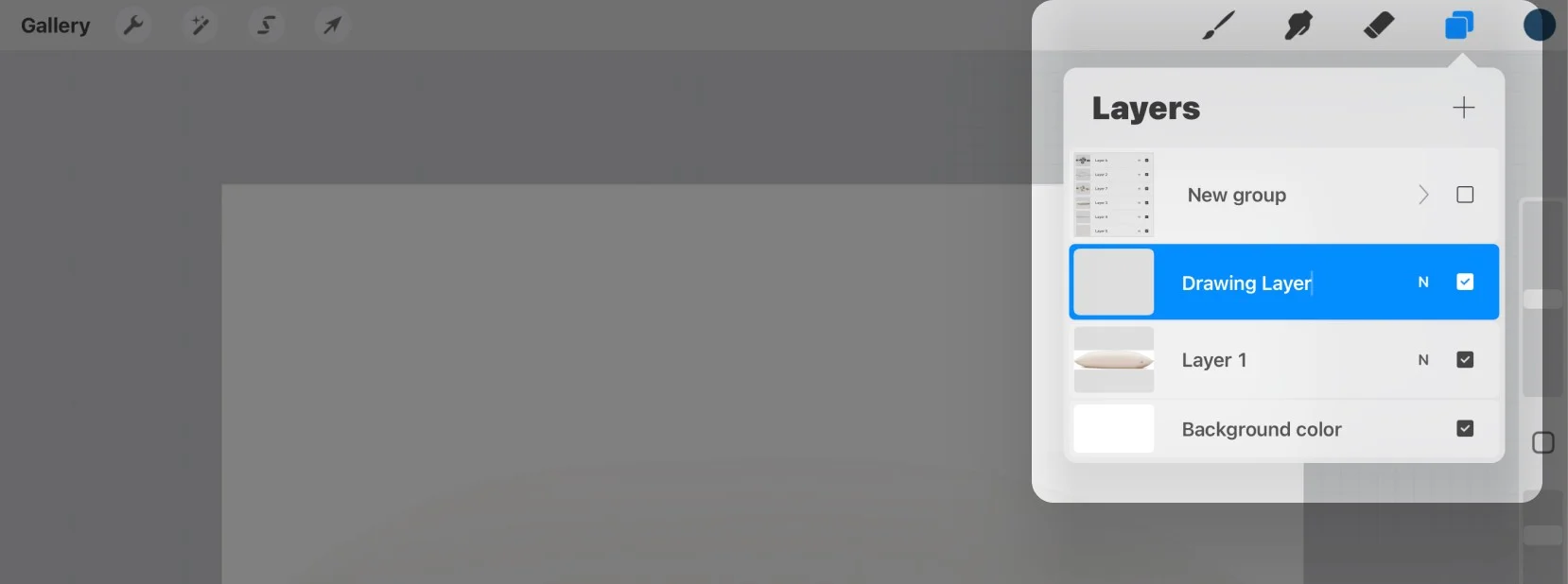
_Tip: To quickly reduce the opacity of a layer, open the layers menu and double-finger tap the layer, and then swipe left anywhere on the screen to slide the opacity down._
Step 5: Select a pencil and a brush
When I set out to illustrate for my blog or newsletter, I don’t want to spend too much time on it. The trick to simplifying the process is like many branding projects. Select only a couple of drawing tools, and stick to them over and over.
I prefer to limit myself to just two types of tools, and this makes the decision-making much less complicated.
I would urge you to experiment with a lot of pencils, ink pens, and brushes in Procreate to get a feel for how you enjoy using them.
If you prefer a very sketchy, informal look, I would opt to use a pencil instead of an ink pen.
I typically use the 6B pencil, and the Gloaming brush. The 6B pencil comes in handy for making thick outlines, and the brush is great for coloring and adding depth.
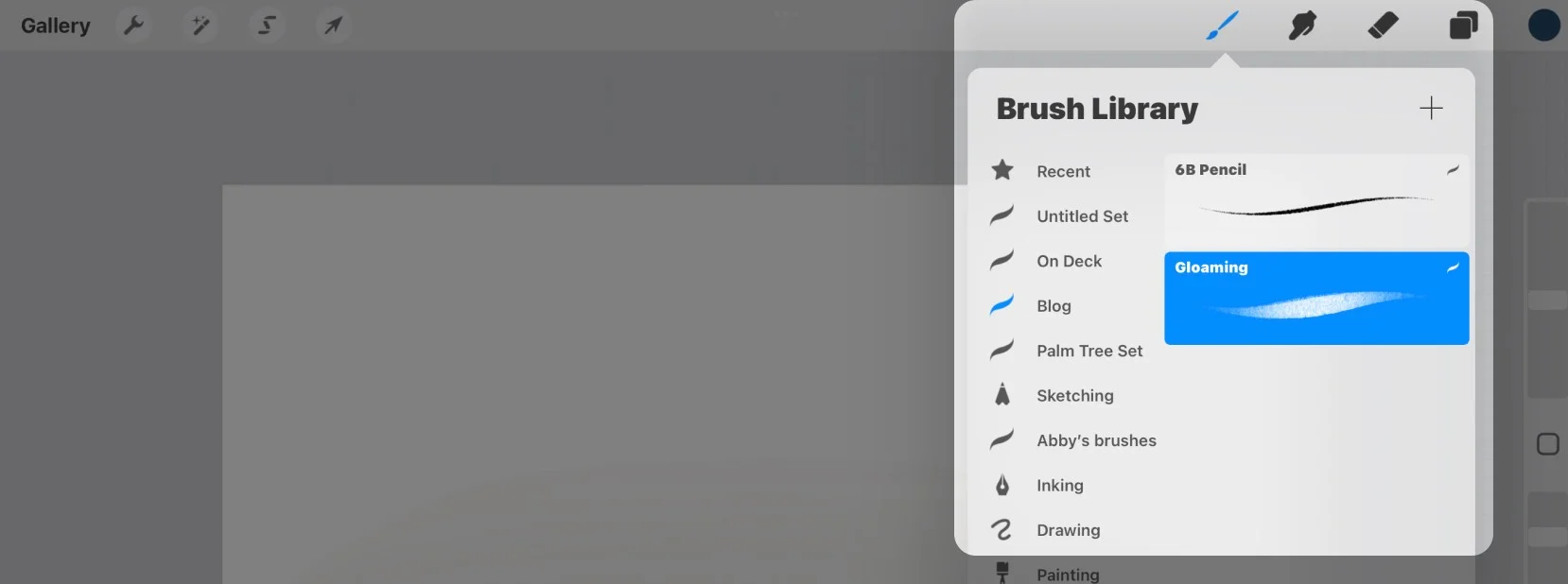
Choose one tool for sketching—an ink pen or pencil—and a brush for “painting” in color. There are no hard and fast rules here, so you could just choose one tool for everything if you prefer. But if you’re just starting out, stick with just a couple.
Using layers, undo, and redo for efficient editing
One of Procreate’s most powerful features is its Layers menu. Think of layers as transparent sheets stacked on top of each other, allowing you to work on different elements of your drawing independently. This means you can edit, move, or delete parts of your artwork without affecting the rest. It’s a game-changer for efficient editing and experimenting with different ideas.
To make the most of layers, start by creating multiple layers for different parts of your drawing. For instance, you might have one layer for your sketch, another for colors, and yet another for details. This way, you can tweak each element without worrying about messing up your entire composition.
And don’t forget about the Undo and Redo features. Made a mistake? No problem. Simply tap the Undo button or use the three-finger tap gesture to go back a step. Changed your mind? Tap the Redo button or use the three-finger tap gesture again to redo the action. These features are lifesavers, allowing you to experiment freely without fear of making irreversible errors.
Step 6: Trace your composition
Here is where the fun really begins. You have your image composition—a visually interesting combination of photos. You have 1-2 drawing tools, and a blank layer to start drawing.
There are many ways to draw, and I’ll share my own. But know that you could search for your favorite artists and try to break down their own style.
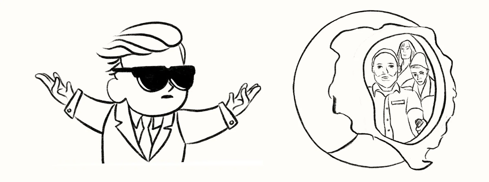
I’ll usually start by tracing my lines like we’re making a coloring book, and then filling in the color later. But if you’re feeling creative, you could try the opposite, or not use outlines at all!
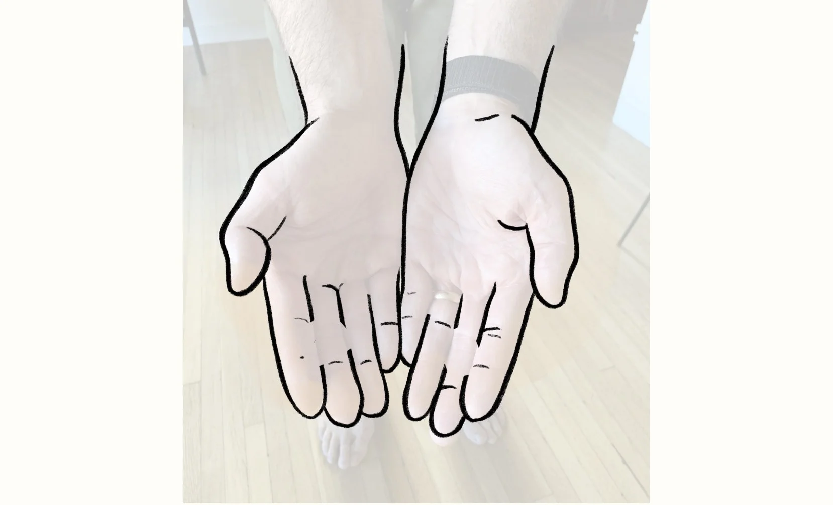
By tracing your remixed composition, you’re melding your ideas into one strong illustration, just through the act of remixing photos. It’s a shortcut to creating something unique, like how a DJ mixes two songs together.
Spend some time here getting a good foundation and a look that you’re happy with. You may think this is cheating, but you’re actually learning more quickly by doing, and developing a skill set more rapidly than if I were to ask you to draw a bird by imagining it.
Step 7: Fill with color
Once you have the foundation of your sketch, create a new layer and we’ll drag this beneath your outline layer. This is how I make sure I don’t accidentally color in my outlines, or ruin any of the work I did before. And we can always erase and go back in time.
**Select your colors using the eyedropper tool
**To quickly replicate the illustration using colors from the original photo, I’ll use the eyedropper tool to quickly get close. By holding your finger on the screen, it will turn into a loupe, allowing you to select the color you’re hovering on, then replace the current fill with the newly selected color.
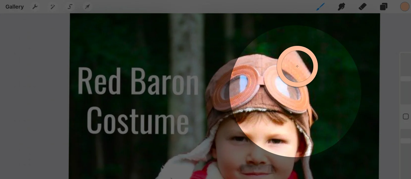
You can make adjustments to this by tapping the selected fill color in the top right corner, and modifying it however you like.
The point is to quickly fill in the outlines with some color, using your brushes. You’re beginning to create an aesthetic unique to you, and a system that’s repeatable for future drawings.
Take some time to add multiple colors if you’d like, and fill your illustration in.
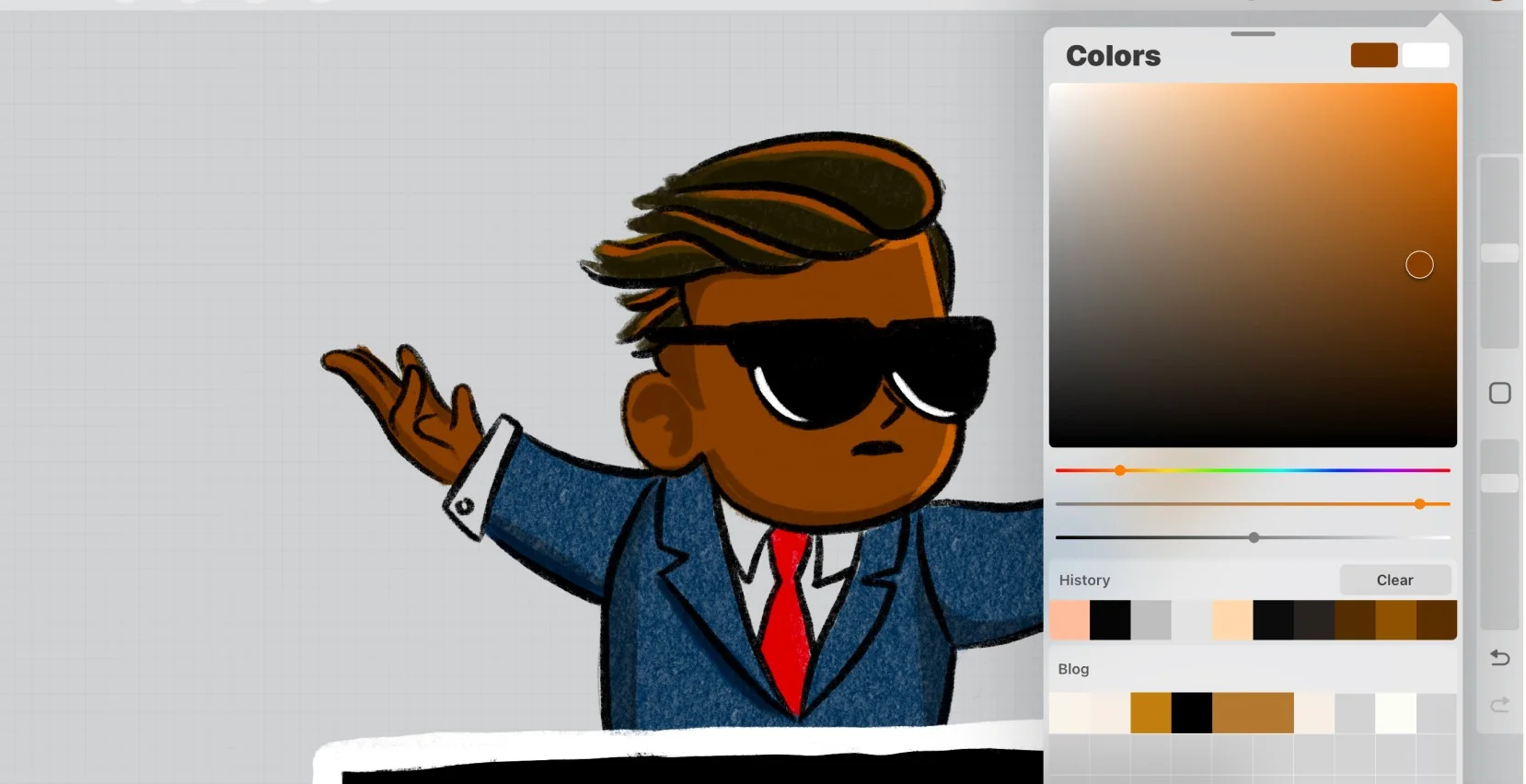
Adjusting colors and using the HSB color model
Color is a crucial aspect of any artwork, and Procreate’s Color menu offers a range of options to help you get it just right. One of the most powerful tools at your disposal is the HSB color model. HSB stands for Hue, Saturation, and Brightness, and it allows you to fine-tune your colors with precision.
To access the HSB color model, tap the Color menu and select the HSB option. From there, you can adjust the hue slider to change the color itself, the saturation slider to control the intensity of the color, and the brightness slider to make the color lighter or darker. This level of control ensures that you can achieve the exact shade you need for your artwork.
Using the HSB model is particularly useful when you want to create harmonious color schemes or need to match specific colors in your drawing. Spend some time experimenting with these sliders, and you’ll quickly see how they can enhance your artwork.
Step 8: Add depth by choosing a light source (Optional)
What you might have right now is a 2D illustration, without any depth or sense of space. What I spend the last 5-10 minutes on is adding a light source to my images. This is optional depending on the look and feel you’re going after, but I recommend trying this out.
Imagine there’s a light—or the sun— sitting somewhere on your canvas. That light source is going to hit your illustration in the same way it hits an object in real life, and will cast shadows. Those shadows give objects a sense of space, and it’s the easiest way to help a drawing come to life.
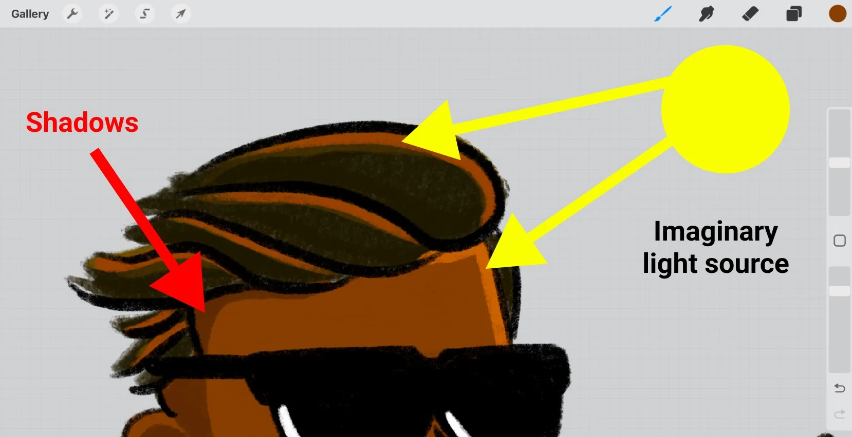
Now instead of just adding some black or white tints to your images, think about adding shades and tints—lights and darks—of the existing colors you’re using. So if you’re using a brown in your image, select that brown and find a darker shade of that color and use that to create shadows.
If it’s helpful, create a new layer to do this so you don’t mess up anything you’ve done already. You can always erase it later.
Using the Procreate smudge tool and liquify feature
Procreate’s Smudge tool and Liquify feature are two powerful options for adding unique effects to your drawings. The Smudge tool is perfect for blending and merging colors, creating smooth transitions and adding texture to your artwork. To use the Smudge tool, simply select it from the Brush menu and start blending. It’s like using your finger to smudge charcoal on paper, but with much more control and precision.
The Liquify feature, on the other hand, allows you to manipulate and distort your artwork in creative ways. Found in the Actions menu, the Liquify tool offers various options like Push, Twirl, Pinch, and Expand. These tools let you warp and reshape parts of your drawing, creating dynamic and abstract effects. It’s a fantastic way to add movement and energy to your artwork.
Both the Smudge tool and Liquify feature can take your drawings to the next level, adding depth and interest that make your work stand out. Experiment with these tools to discover new techniques and effects that can enhance your creative process.
By incorporating these new sections, the article will provide a comprehensive guide to using Procreate, helping readers to develop their drawing skills and create unique, personalized artwork.
Step 9: Export your image
The last step in the process is to export your file from Procreate so you can use it on your blog or newsletter.
Hide the original layers
First, head to your layers palette and hide the original image layers and anything else you want to prevent from exporting.
Share your image as a PNG
Head to the wrench icon in the top left, and click the Share action. I usually opt for a simple PNG file because you don’t lose any quality. Because your canvas is large, you might want to downsize it later to keep the file size small, but for now just get the hi-res image to use for whatever you’d like.
Step 10: Learn to draw with consistency and take it easy on yourself
Whether you’re writing or drawing, sitting down with a blank piece of paper is difficult. Find some photos to copy to kickstart the process.
This process is what I use weekly for creating all of my illustrations, and I hardly get stuck. My goal is to produce something of high quality in 30min or less and help this newsletter stand out from the noise.
The main takeaway is to limit your drawing decisions and find a repeatable method you can use, day in, and day out. Consider exploring tutorials and YouTube videos for learning new drawing techniques and improving your skills.
If you decided to draw something, I’d love to see it!
